MasterChef 2019 Season – PATTERNS AND INSIGHTS
Summative Report
Introduction
The social media datasets used in this report were collected directly from the Australian ‘Twittersphere’ to provide two main datasets: tweets_2019.csv and tweets_2020.csv. The data collection process was determined by the conditions that all tweets must contain the keyword ‘masterchefau’ and be posted during the 2019 and 2020 seasons of the TV program MasterChef Australia. The 2019 dataset for example contains social media data collected between the 23rd of April and the 29th of July. MasterChef is a competitive cooking game show broadcast on the 10 network.
Two folders labelled MasterChefAU_2019 and MasterChefAu_2020 were provided for social media data analysis and contained files prepared for use within various data visualisation software programs. The dataset labelled Tweets_2019.csv, was chosen to become the basis of this summative report and to create Tableau visualisations in stage one. The second stage involves a network analysis within Gephi using The Retweets_2019.csv file. Data visualisations were designed to assist in identifying patterns and providing insights which are discussed throughout this report.
Tableau Visualisations
The process of Social media data analysis began by creating visualisations within Tableau based on the raw dataset labelled ‘Tweets_2019.csv’. The creation of the visualisations was guided by a process of general investigation followed by an ‘interviewing’ stage. An initial series of 12 visualisations were created and the topic for each visualisation is listed below.
Stage one: Interview the data and create visualisastions
| Tweets / time (2019) | Tweet types (2019) | Most active users (2019) |
| Most retweeted user | Most replied to tweet ID | Most @replied to users |
| Most @mentioned user | Young / Old Twitter accounts | hashtags/time |
| Top hashtags | Top URL/domains shared | Are the majority of accounts old / young? |
The first visualisation created was the most popular tweet over time (2019). On the 29th April, there was a noticeable peak which was probably the season premiere and another two large peaks on both the 18th and 23rd of July. Apart from the three large peaks mentioned, there were other peaks in Twitter activity that occurred every five to seven days. These weekly spikes represent a response on Twitter to each MasterChef episode being shown on TV. The very large peak of activity on the 23rd of July (7013 tweets), may be attributed to the season finale or some other major event which is explored later in this report.
The next visualisation created was, most popular tweet types. The results roughly mirror the results of the previous visualisation except for the spike in retweet activity on the 18th and 23rd of July. The retweet activity on those dates surpass the amount of original tweets and mentions which were higher in number until that point.
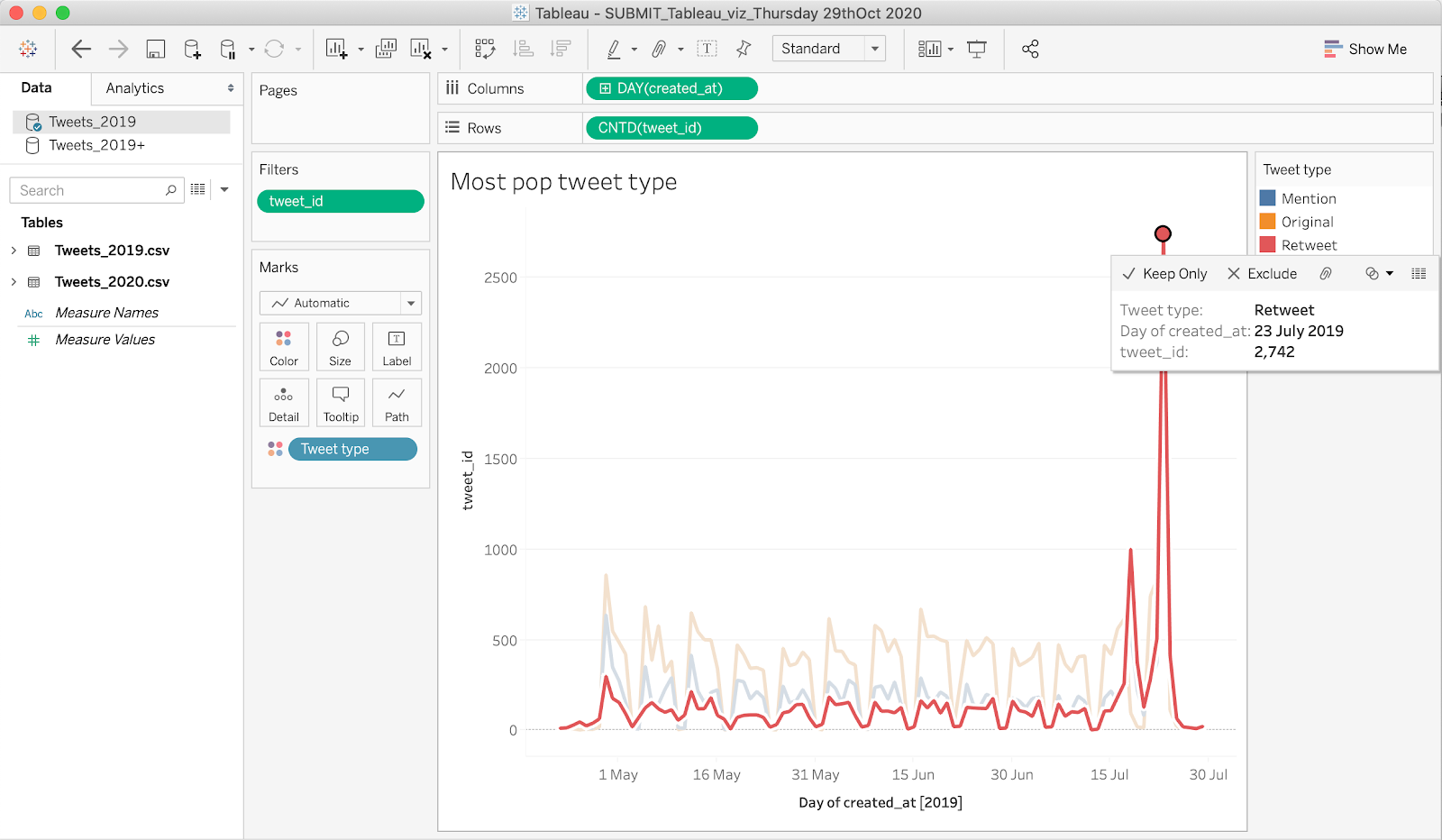
The difference between mentions and retweets and the significance of each tweet type for this report is worth mentioning. The notable spike in the amount of retweets occurring on both the 18th and 23rd of July, suggest that something of importance in the MasterChef program had taken place. In terms of percentage, retweets are worth 22% of tweets between the 22nd of April until the 29th of July so, this was considered to be a significant pattern. Please refer to the screenshot of the visualisation: Donut chart_tweet type below. Users felt compelled to share news of an event with their followers. In comparison, a mention signifies a desire to respond to a user, take part in the online discussion and become a part of the MasterChef online community.

To further investigate the data and discover insights, the focus became; Which Twitter account had generated the most interest and activity around it? In order to do this, The following visualisations were chosen from the initial set of 12:
- most mentioned user name, most @ replied to users, the most retweeted user ID.
In all 3 of the visualisations above, the most popular twitter account was @masterchefau however, in the next visualisation:
- most in reply to tweet,
the user name wasn’t supplied. The solution was to investigate the text summary of the dataset and during this process, a lot of negative audience sentiment was discovered. The negative sentiment was directed toward MasterChef and the judge George Calombaris. This was in stark contrast to the type of euphoric or disappointed tweet, that would normally be associated with an end of season finale.

The original tweet that caused the high level of retweet activity was identified by retrieving the tweet ID:
- In_reply_to_tweet_id: 1153547124681953282
This tweet ID was found in the appropriate column and then used to exclude all other tweets within a ‘tweet ID’ filter within another visualisation called:
- Original-most in reply to tweet ID
The text of the original tweet was successfully identified which confirmed important news. It was confirmed that on the 23rd of July, MasterChef Australia reported on Twitter that all 3 MasterChef judges were leaving the show. This also corresponds with the large spike of retweet activity identified in the most popular tweet type.
The other peak of retweet activity worth investigating was on the 18th of July, 2019. The text field for the most retweeted tweet was investigated but drew a blank. The main activity on the 18th of July was a retweet so, it was decided to investigate a visualisation created for the most shared URL. This process revealed that twitter users were sharing an online newspaper article published in The Sydney Morning Herald on the 18th of July 2019. The article reported that MasterChef judge George Calombaris had underpaid staff in his numerous restaurants to a total of A$7.8 million dollars. This dollar value and the hashtag #MasterTheft, is notably mentioned in the text section of the screenshot listed above. Another visualisation was created in Tableau to identify the 2nd most popular hashtag by using a filter to exclude #mastertheftau. This hashtag made its entry into the Twittersphere on the 19th of July, the day after the online article re: George Calombaris appeared. This sequence of events confirms the power of interconnectivity amongst users of social media and the rapid spread of information that is possible.
Network Analysis using Gephi
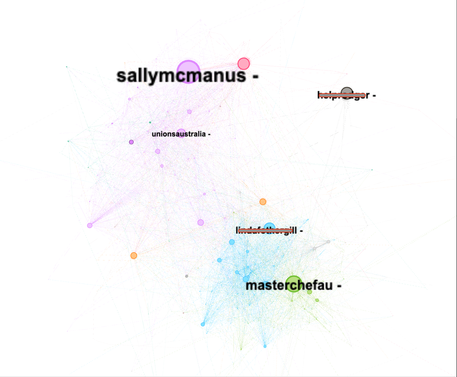
Gephi was used to conduct a network analysis of the retweets_2019 dataset. The network analysis of retweets within Gephi utilises the following parameters:
- the coloured partition attribute was based on modularity class
- the node size attribute was based on degree.
The disproportionally large size of the node for @sallymcmanus, secretary of the Australian Council of Trade Unions, demonstrates how many interactions were happening between herself and those connected to her. The screenshot of the Gephi visualisation below, calculates her node to be even larger than @masterchefau. This suggests that the intensity of her communications and her connectedness to others within her online community, may have been a significant factor in influencing public sentiment toward the MasterChef program. Negative sentiment towards both MasterChef and George Calombaris identified earlier in the report, supports this assumption. It can be assumed that when various entities within the union movement became involved in the online discussions and their comments were being retweeted, this had a negative impact on the MasterChef Australia brand.
Conclusion
The visualisations created within the scope of this report and the insights gained from them, demonstrate the ability of social media to play an increasingly important role in providing audience feedback and producing outcomes within media events. While data for just Twitter has been collected and researched, it is uncanny to see the correlation between spikes in activity on Twitter and connected events that occur on the program. Competitive reality TV shows generally have an inclusive approach with their audience and MasterChef audiences demonstrated a high level of activity online via Twitter. The affordances of shareability on Twitter, can generate high levels of negative / positive sentiment regarding news stories very quickly. The controversy surrounding the MasterChef judge George Calombaris, is one such example where TV audiences actively retweet breaking news on Twitter, which had a negative impact on the MasterChef Australia brand. This may have directly influenced Network 10’s decision to fire him. The issue of MasterChef and George Calombaris, is a very good example of just how important an active social media listening campaign has become, in order to assess audience sentiment and become proactive in managing public relations disasters.

Good work, Simon! And well-written, too!
Cheers David
>
LikeLike
Hi David, thanks for leaving for a comment. I’m not really on top of the comments section of my website and only discovered your comment because I’m currently tidying up the website. Thanks again.
LikeLike